
Michael Estiban Smith
UX & Design Director

7-Eleven Store Console
Designing confidence into the frontline
Not every interesting design problem is a glamorous one.
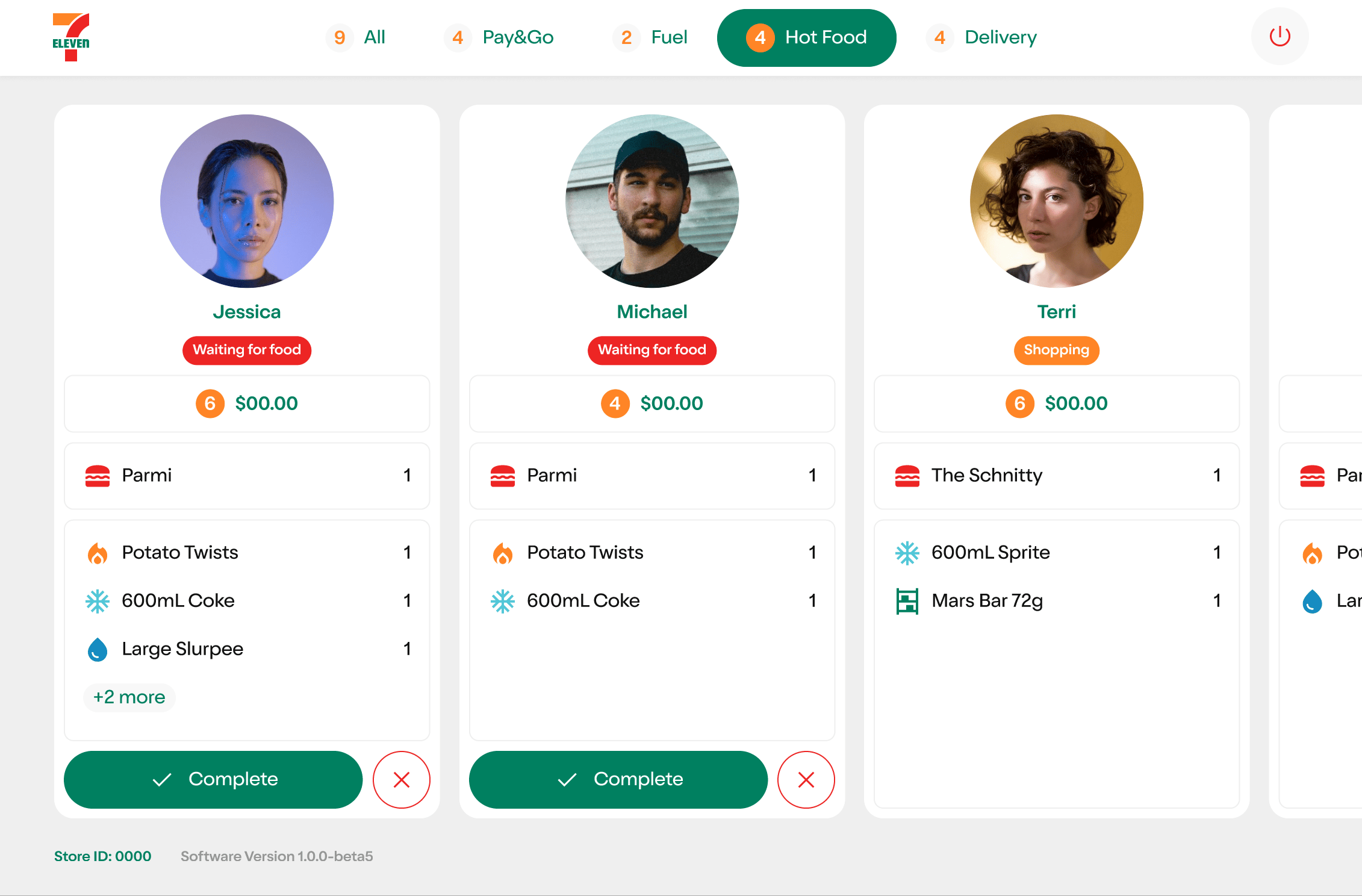
The 7-Eleven Store Console isn't a customer-facing product. It doesn't have a slick onboarding flow or a beautiful checkout. It's a tablet display used by store team members — and it solved a problem that nobody had anticipated when 7-Eleven launched Pay&Go, their self-serve scan, pay, and go program.
The problem: team members couldn't tell the difference between a Pay&Go customer and a shoplifter. And they were afraid of falsely accusing a genuine customer of theft.
The Store Console gave them the information they needed to act with confidence — and what happened next was one of the most interesting behavioural outcomes I've encountered in my career.
Platform
Custom tablet application
Role
Lead UX Designer
Duration
MVP + ongoing in-market iteration
Outcome
Reduced frontline anxiety and a measurable increase in team member confidence across Pay&Go stores
The Challenge
Pay&Go allowed customers to walk into a 7-Eleven, scan items with their phone, pay in-app, and leave without interacting with staff.
For customers it was seamless. For team members it created a new and unsettling ambiguity — every customer walking out without going to the register was now a potential source of anxiety.
The risk wasn't just theft. It was the fear of falsely accusing a legitimate customer. That fear was enough to paralyse staff and undermine confidence in the entire program.
Discover
I engaged 7-Eleven stakeholders to understand the business perspective — operational goals, theft risk appetite, and program success metrics. I then spoke directly with store team members to understand what they actually needed on the floor. These conversations revealed that the core need wasn't theft prevention. It was certainty — team members didn't want to catch shoplifters, they wanted to feel sure before they approached anyone.
Define
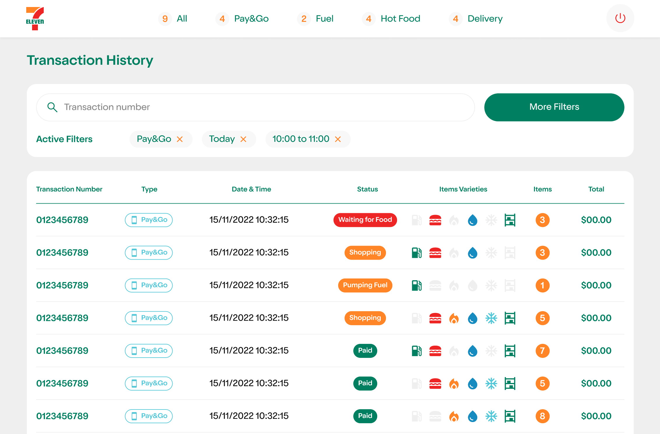
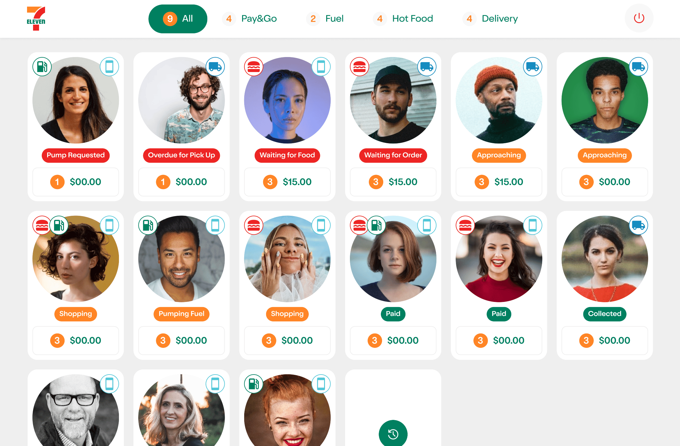
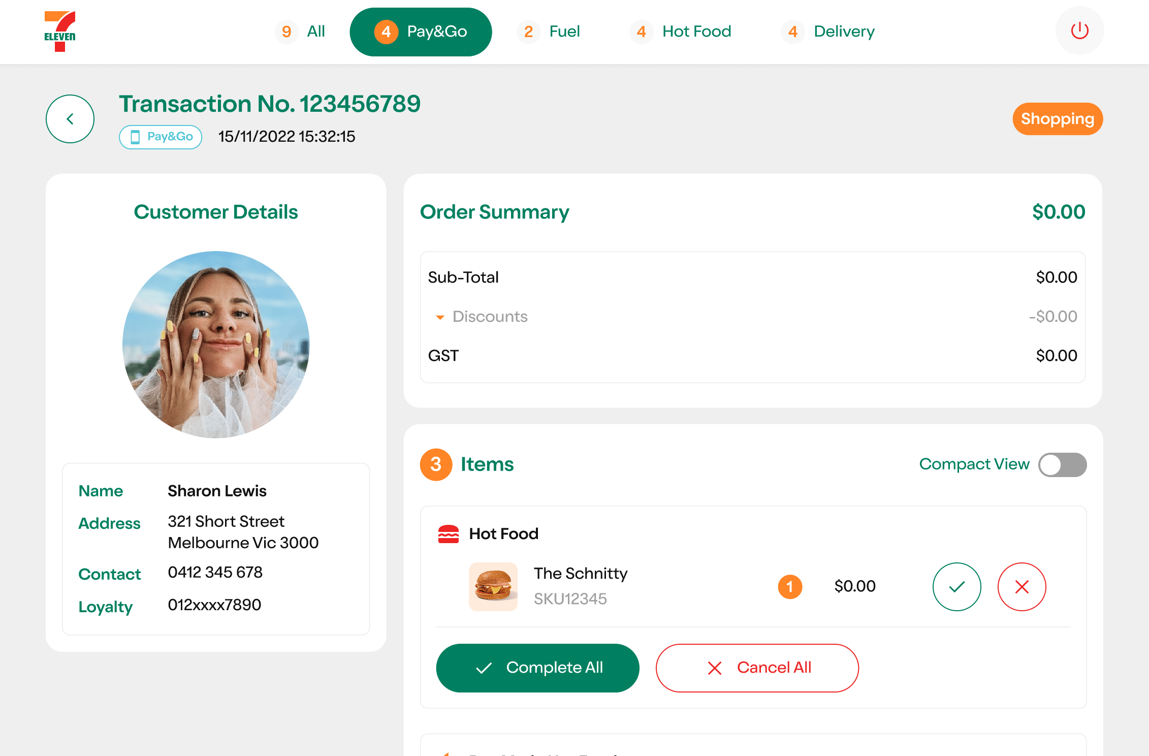
Research pointed to a clear problem: team members needed a simple, at-a-glance way to know which customers were active Pay&Go users and whether they'd completed their transaction before leaving. The UX strategy focused on reducing cognitive load — presenting only the information that mattered, at the moment it mattered, in a format that required no training to understand.
Design
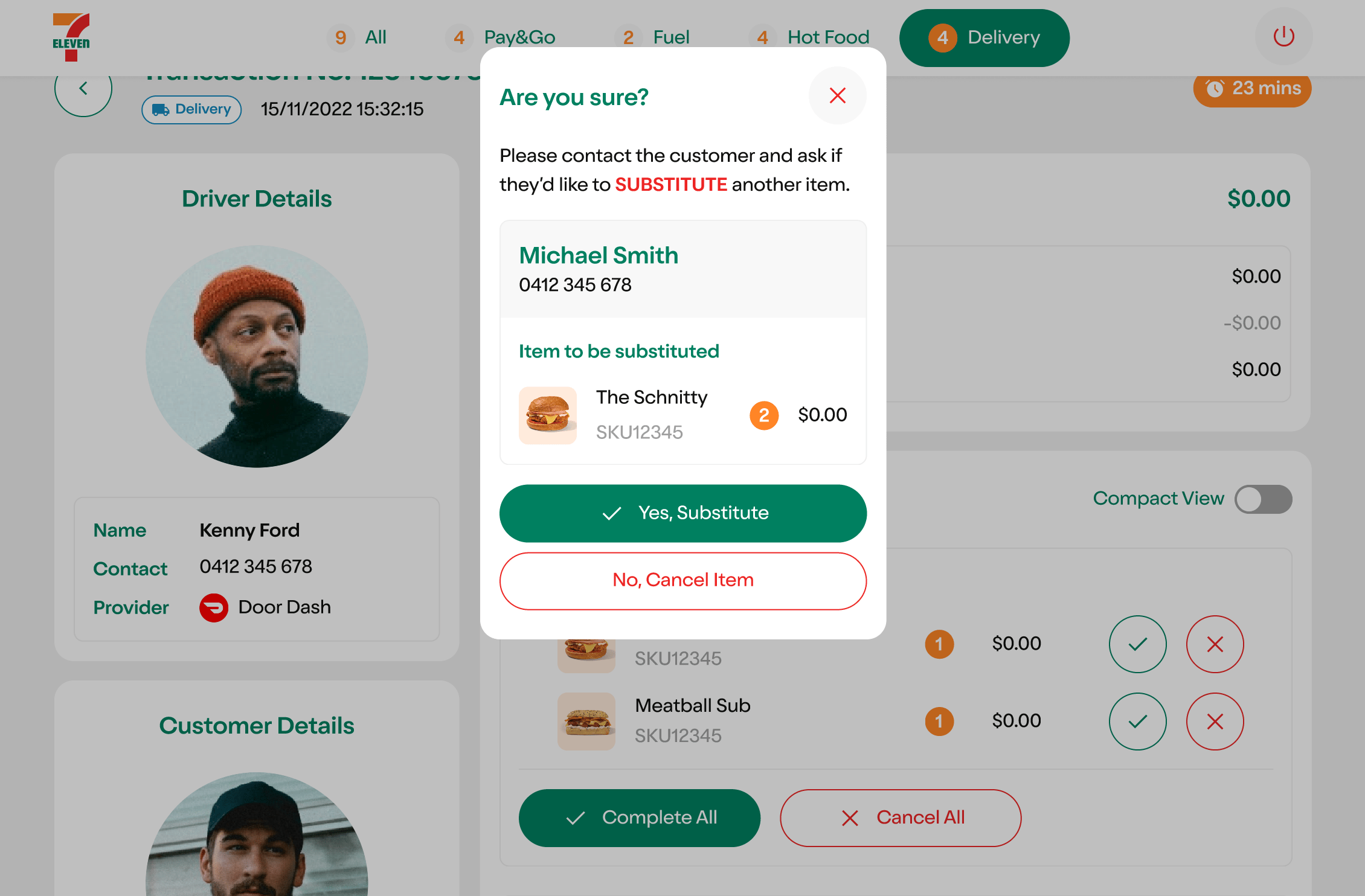
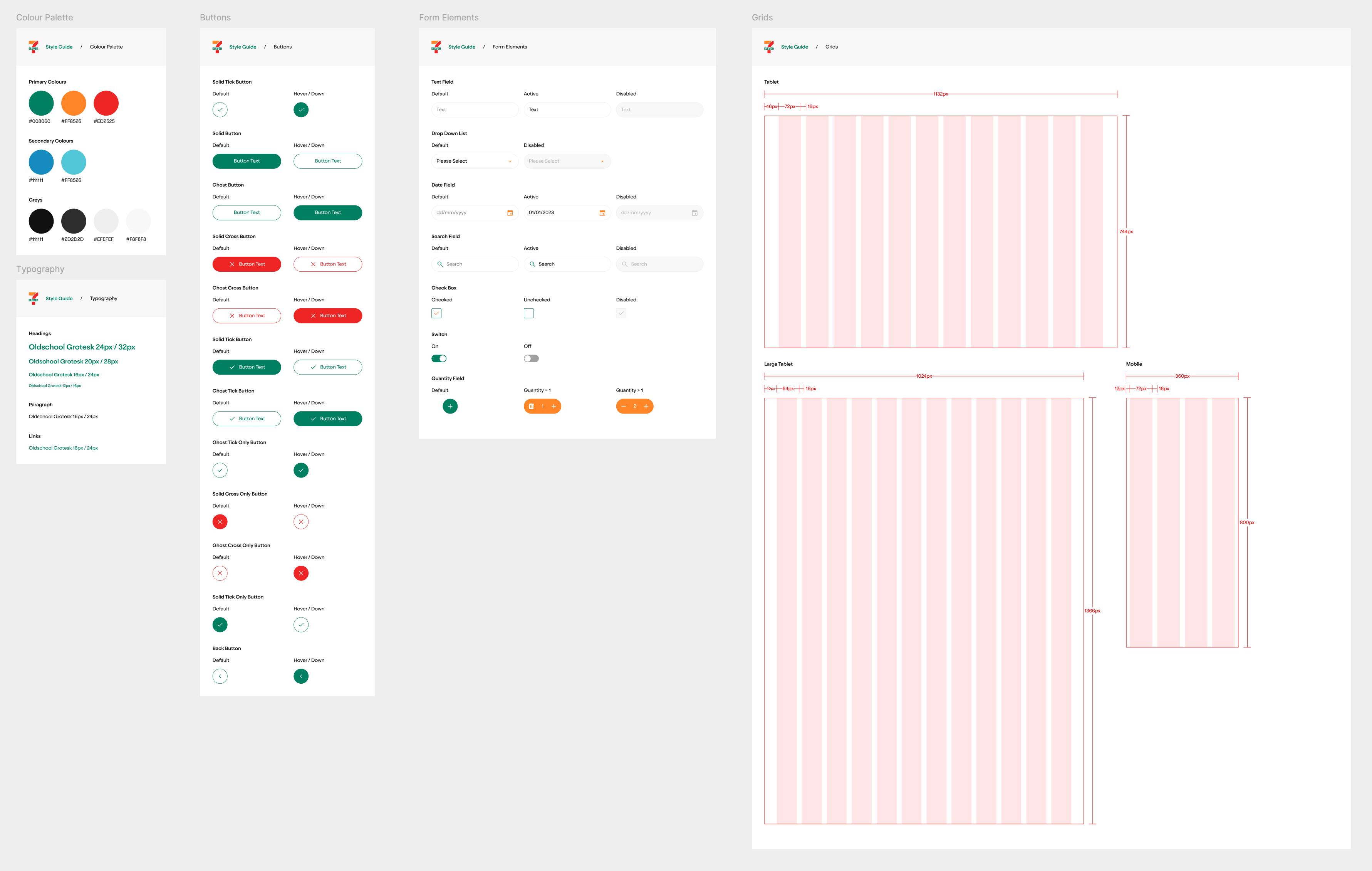
I drafted and iterated on a tablet display showing active Pay&Go customers, their transaction status, and purchase completion before exit. Prototypes explored colour coding, iconography, and layout options — all optimised for a noisy, fast-moving convenience store environment. The final UI was intentionally simple and scannable from across a store. Designs were tested with team members before launch, with iterative enhancements continuing in-market based on ongoing feedback.
Outcome
The Store Console gave team members the confidence to act — and what emerged was an unexpected behavioural insight. In either scenario — Pay&Go customer or potential shoplifter — the most effective approach was the same: assume the customer was having difficulty with the app. For a genuine user this felt like timely support. For a shoplifter it was a face-saving off-ramp. A de-escalation strategy that emerged organically from the frontline — and one no brief could have anticipated.
What I learned
The best outcomes aren't always the ones you designed for. Give people the right information at the right moment and they'll often find smarter solutions than anything you could have prescribed. It also reinforced something I believe deeply — internal tools deserve the same rigour and craft as consumer-facing experiences. The people using them every day deserve no less.

About
I'm a UX and design leader with 19 years of hands-on experience — from discovery and research through to interaction design, UI direction, and design systems. I lead from within the work, not above it.
I've spent the last eight years at Balance and Digitas Australia building and leading UX and design capability — growing practice, embedding research, and delivering across some of Australia's most recognised brands. That work contributed to Balance being awarded Campaign Agency of the Year in eCommerce in 2024, and Digitas Australia taking out the same award the following year.
Let's talk
If you're building a design-led digital practice and need someone who'll get into the work, raise the quality, and help shape where the agency goes next — I'd love to talk.
Get in Touch

Find me on LinkedIn
7-Eleven Store Console
Designing confidence into the frontline
Not every interesting design problem is a glamorous one.
The 7-Eleven Store Console isn't a customer-facing product. It doesn't have a slick onboarding flow or a beautiful checkout. It's a tablet display used by store team members — and it solved a problem that nobody had anticipated when 7-Eleven launched Pay&Go, their self-serve scan, pay, and go program.
The problem: team members couldn't tell the difference between a Pay&Go customer and a shoplifter. And they were afraid of falsely accusing a genuine customer of theft.
The Store Console gave them the information they needed to act with confidence — and what happened next was one of the most interesting behavioural outcomes I've encountered in my career.
Platform
Custom tablet application
Role
Lead UX Designer
Duration
MVP + ongoing in-market iteration
Outcome
Reduced frontline anxiety and a measurable increase in team member confidence across Pay&Go stores
The Challenge
Pay&Go allowed customers to walk into a 7-Eleven, scan items with their phone, pay in-app, and leave without interacting with staff.
For customers it was seamless. For team members it created a new and unsettling ambiguity — every customer walking out without going to the register was now a potential source of anxiety.
The risk wasn't just theft. It was the fear of falsely accusing a legitimate customer. That fear was enough to paralyse staff and undermine confidence in the entire program.
Discover
I engaged 7-Eleven stakeholders to understand the business perspective — operational goals, theft risk appetite, and program success metrics. I then spoke directly with store team members to understand what they actually needed on the floor. These conversations revealed that the core need wasn't theft prevention. It was certainty — team members didn't want to catch shoplifters, they wanted to feel sure before they approached anyone.
Define
Research pointed to a clear problem: team members needed a simple, at-a-glance way to know which customers were active Pay&Go users and whether they'd completed their transaction before leaving. The UX strategy focused on reducing cognitive load — presenting only the information that mattered, at the moment it mattered, in a format that required no training to understand.
Design
I drafted and iterated on a tablet display showing active Pay&Go customers, their transaction status, and purchase completion before exit. Prototypes explored colour coding, iconography, and layout options — all optimised for a noisy, fast-moving convenience store environment. The final UI was intentionally simple and scannable from across a store. Designs were tested with team members before launch, with iterative enhancements continuing in-market based on ongoing feedback.
Outcome
The Store Console gave team members the confidence to act — and what emerged was an unexpected behavioural insight. In either scenario — Pay&Go customer or potential shoplifter — the most effective approach was the same: assume the customer was having difficulty with the app. For a genuine user this felt like timely support. For a shoplifter it was a face-saving off-ramp. A de-escalation strategy that emerged organically from the frontline — and one no brief could have anticipated.
What I learned
The best outcomes aren't always the ones you designed for. Give people the right information at the right moment and they'll often find smarter solutions than anything you could have prescribed. It also reinforced something I believe deeply — internal tools deserve the same rigour and craft as consumer-facing experiences. The people using them every day deserve no less.
About
I'm a UX and design leader with 19 years of hands-on experience — from discovery and research through to interaction design, UI direction, and design systems. I lead from within the work, not above it.
I've spent the last eight years at Balance and Digitas Australia building and leading UX and design capability — growing practice, embedding research, and delivering across some of Australia's most recognised brands. That work contributed to Balance being awarded Campaign Agency of the Year in eCommerce in 2024, and Digitas Australia taking out the same award the following year.
Let's talk
If you're building a design-led digital practice and need someone who'll get into the work, raise the quality, and help shape where the agency goes next — I'd love to talk.
Get in Touch
Find me on LinkedIn